Designing for the User – User Testing

Hi,

User Testing :

I Had Various people testing out my website whilst i was building it but decided to create a feedback sheet that 2 of the users filed in.

This is great experience for when i build a website again but also a web designer could take some offense to some of the comments that users put back but as a web designer you must brum it into your head that you have to design for the user and that you will never be happy with your website and the users have different tastes of websites stemming from usability, style, and how easy it is to navigate.

I have scanned the sheets and here they are below and i have asked them to be completely honest about their feedback.

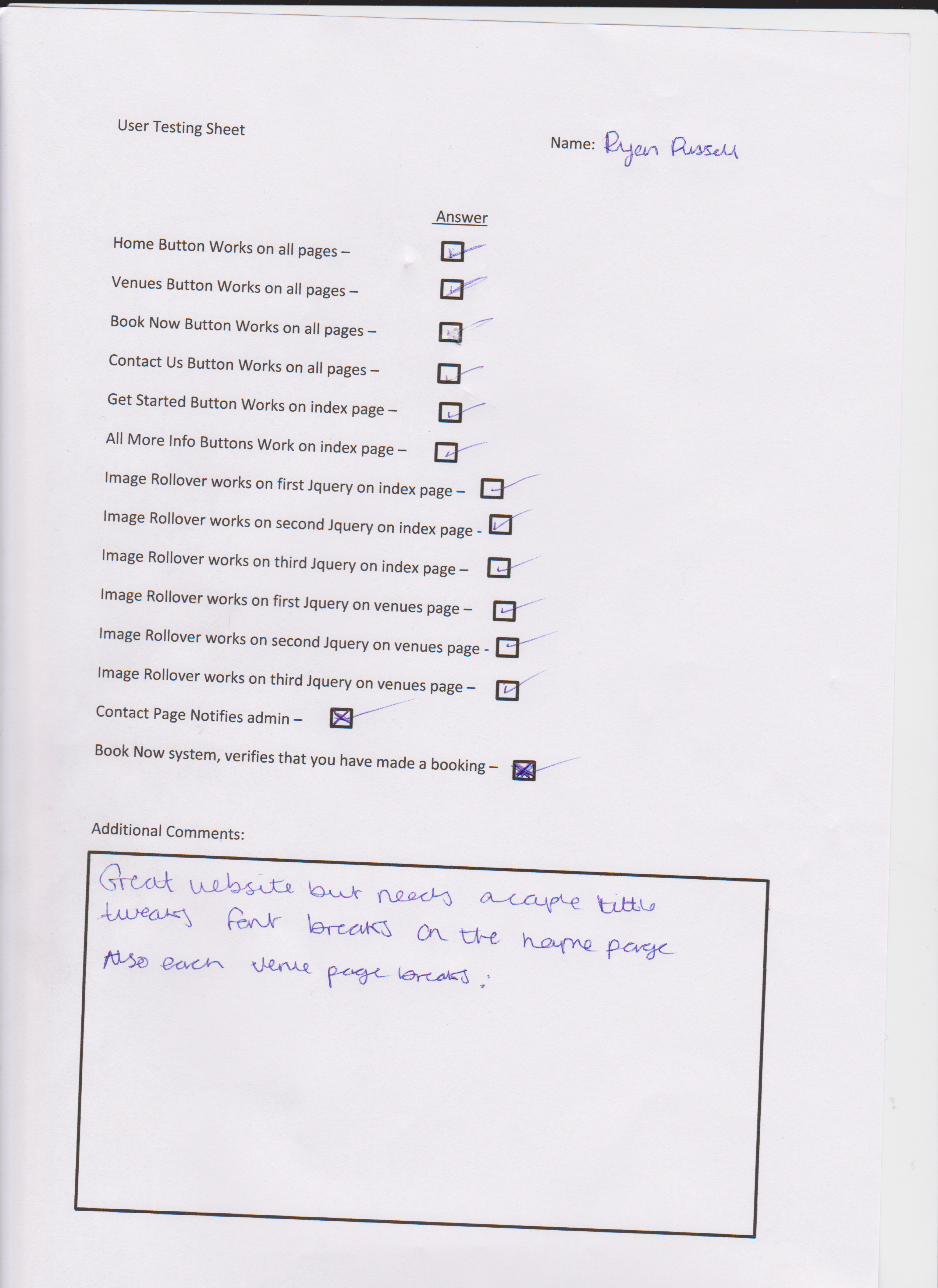
Ryan Russell (Friend) :

FeedbackRyan 001

Danny Fowler (Friend) :

FeedbackDanny 001

What i have learn’t from the feedback ?

That i have made a couple of mistakes when coding this website up. I havent been spreading my eyes around different browsers and just sticking to IE but only concentrating how it looks on my laptop when by this comments it looks completely different.

In the Future i need to get off my laptop and experiment with other device, even though i decided to try bootstrap out it does fit to different portable devices but this breaks the containers. So i’m hoping to learn this in the future.

I found it hard experiencing some of the classes in bootstrap and then when you creating your own containers it then breaks. This had been a great learning curve for me and im glad this feedback has come from friends and especially Kev because i want to be knowing what is going wrong when i create a website in bootstrap because knowing i can use HTML/CSS code i want to expand into portable devices .

Thanks

Designing for the User – Evaluation

Hi,

I Have reviewed my my feed back that i have got off my user testing and also sat back and gave my website a final look through after its all been put up to the server and i have come to some conclusion about my website.

With me just starting off in bootstrap its a tricky piece of kit but it is very useful for a web developer because Jquery examples are already pre-installed in the files when you download it, you just need to know how to use it and that’s what was the problem with my website. Browsing various tutorials trying to find how to code this website up.

I do believe now i have a fully working website this will lead me into good stead for next semester where we will be learning a lot more about bootstrap and with this knowledge i will have a heads up.

Down to the website i believe the website is not bad compared to some of the additional comments in the user testing but it did need  a lot of tweaking and healing before it went up on the server. A problem that i had with this website in particular was that with the Jquery i had to put a separate container around all of the picture sliders and that probed a problem, i couldn’t center that container for some reason. I don’t know what the explanation was for this but i have found out that most of these party booking websites have a sidebar for maybe ads etc so that’s what i will put in its place.

To the Responsive side of this website. I have tried my hardest to get this to work on device such as IPad, IPhone etc but theirs always a couple of pixels out or something is out of place. I found this great add on that is incorporated into bootstrap and that is the little icon you can use for devices that when it is minimized it brings an icon up for the navigation, which i will show in the presentation.

Thanks.

Designing for the User – Adaptive vs Responsive

Hi,

Task 2

In the brief Task 2 clearly states, In your Blog clearly relate that you have researched Adaptive and Responsive web design you don’t have to build any of these websites but just because i have used Bootstrap mine will be Responsive in a way, just because i have recently just started using the program and not learned the full grips to it and just learning it on tutorials of the web this will help me a lot in Year 2.

Lets start off with the review :

Adaptive design is quicker and easier to implement, it’s generally a bad practice to go about. It caters to today’s devices only and doesn’t make provisions for new devices with different widths that may be released tomorrow. Responsive on the other hand, works with every width between the smallest and largest versions. While this means much more work on the developer’s part to ensure there are no breakpoints within the site, it also means the website is much more likely to work properly on any new device.

Responsive design does NOT have breakpoints set specifically to today’s devices. It’s breakpoints are set to when the site actually breaks in design. Adaptive on the other hand, is based on actual device widths. Responsive and adaptive web design are all about CSS and media queries. The addition of JS to help this along, while not a good practice for other reasons, does not define what adaptive and responsive web design are. It’s all about the CSS in this point and time. Everything else a developer uses just helps one of these one.

While adaptive design is not the ideal way to go, it has it uses. If a client comes to you and wants a mobile friendly site, but doesn’t want to pay for an entire recoding, it ‘s better to make the site work at today’s current viewports than to try and force the site to be fully responsive. Also, sometimes the client’s budget doesn’t allow for a full responsive site. Other than those scenarios though, there shouldn’t be any reason to implement this.

The difference between the two are clear. Adaptive is in reaction to devices – responsive is in anticipation of devices.

Thanks

Designing for the User: 5 Websites with JQuery and/or Javascript implemented

Hi,

Task 1 :

As apart of our assignment and actually the building of our final website they has to be some documentation with the website that is highlighted on the blog. Task 1 is clearly stated that you have to write a review at least 5 JQuery and/or Javascript websites and write a couple of sentences about it.

So here is a write up in the first 5 websites i found implementing certain features like Picture Slider etc.

1. Florida Flourish

scr_floridaflourish1

http://www.floridaflourish.com/

Features: Mouseovers with transparency, slideshow, Navigation Rollovers
Description: The brilliant colors and detail of the illustrated tree on this splash page are immediate attention-grabbers. Click on any of the categories branching from the tree and you’ll get not only descriptive jQuery-driven content but a completely different tree, too.

2. Orange Label

scr_orangelabel1

http://www.orangelabel.com/

Features: Image pre-loading.

Description: Image pre-loading is the extent of Orange Label’s use of jQuery. As you scroll down, portfolio items are added to the page (with a rotating graphic telling you that they’re pre-loading). The illustration at the top is big, colorful, highly detailed and delicious eye candy.

This is something we also used in CATS when we are talking about people and their online avatars and creating little worlds for themselves online.

3. Tomas Pojeta

scr_pojeta1

http://www.pojeta.cz/

Features: Sky, ocean, underwater.

Description: Pojeta adopts a motif (a motif is where as you scroll down the page something happen. For example gets lighter or some sort of events) that goes from high altitude to below the surface. The top of the website is in outer space, with its highly detailed rocket and monkey. Scroll down and you’ll see aliens and balloons in the lower atmosphere. Further down is an Easter Island-looking piece of land in the middle of the water, which leads to an underwater view with a submarine. Each illustration fits, and the transitions are about as seamless as it gets.

4. James Anderson (England Cricketer)

26

Features: Flip chart images resulting into his figures. Lines in the center of the page represents hawk eye but then cross matches with his figures with balls instead.

Description: Seen as Jimmy Anderson is a cricketer and the old ways of recording the statistics for a game that’s what James has tried to represent on his Personal Page. Also as the website kicks in a bowler line in the middle of the page forms like in a real life hawk-eye and then balls along that line also generate his statistics from his cricketing career.

5. Tori’s Eye

scr_toriseye1

Features: Origami birds flying horizontally.

Description: The creators of Tori’s Eye have built a website with any one of those features and you’d have something completely original. The website insists of blue origami birds to represent tweets instead of just have static pictures. For these creators, having all of these features wasn’t enough. They made the counter-intuitive decision to do all of the animation without Flash!

Thanks.

Designing for the User – Venue Page Layout

Hi,

Looking on from my front page i have designed a Venue layout before i actually start coding the website out. This Layout page will be mainly for when the user clicks on ‘More Info’ button on any of the venues it will come up with a picture of the venue and then all the vital details about that venue.

Here is the image i created in Photoshop :

Designingfortheuser-Partyvenuelayoutorg

As you can see if have stuck with the same colour pallet along as the front page but this might change because i don’t believe that this is the right colour pallet for this kind of website.

They are two buttons running along side the image which leads to book now which will open a form that will book it but i don’t think i will go that into depth within the website i just want the user to feel comfortable and know where they are when they are browsing.

Other information like Location and Venue type are also within this page and this can define the venue. Also they are information for Vibe, food and overview this will really sell it to the user.

Thanks


Designing for the User : Photoshop Template

Hi

Im just thinking through various ways i can interact the user to the website and i am thinking javascript, jquery the full lot. I want to implement all this into the website because i want the best possible experience for the user.

So after i go the Party Organiser for older adults i started researching and i found this American website that is a Party Organiser and i like their template, i’d like to use that template and alter it abit.

The website is http://www.birthdaypartybooker.com/

Screen Shot 2013-03-19 at 23.12.12

So went on Photoshop and just tried to design a simple template that matched this, didn’t really think of a colour palette because that will be decided later. Also in this template is shows some picture sliders that i will be adding to show of my venues. Here is the Photo :

Designingfortheuser-Partyorg

This website will be responsive that’s why the buttons for Book Now and See All are so big, so the user can click on them on a tablet.

Thanks