Visual Communications : Assignment 2 – Evaluation

Hi,

Assignment 2 was a really big and important assignment in the eyes of web developer because when your developing your own website/ portfolio you will be able to apply these key skills that i have learnt into further  development of branding myself.

I really liked this assignment because i have never branded myself before and i think the nearest i have come to promoting myself is my CV to get my part-time job.

Also along with this course we have to create our own portfolio website and i have applied the logo i did for visual comes and that now promotes me.

I feel like this assignment i have improved, but its just experience with software and applying that into the final project because i have a lot of ideas and hopefully this will show in the other assignments.

Thanks

Visual Communications: Assignment 4 – Rationale

Hi,

To end this semester of Visual Communications with all the content i have uploaded over the past 4 assignments i will end with the final Rationale of Visual Communications.

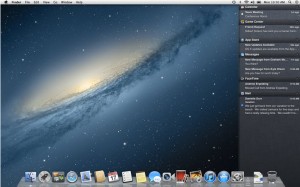
For the Final Assignment it was all based on Advertisements. Being a Apple fan I am i started reviewing operating systems that they have brought out and i thought the newest operating system, Mountain Lion’s branding was mediocre but got millions of people to buy the new operating system because its Apple.

At the beginning i thought lets go straight into the TV Advertisement because Apple showcase most of their technology on the TV, for example the IPhone 5 etc

As you can see in my treatment on how i planned out my advert by drawing down some sketches of how i wanted each scene to look like and you can find these on a earlier post.

At the end of the TV AD i want a Mountain Lion with a Apple Logo coming out of its mouth showcasing the Operating System then a tagline, i therefore took that final scene of my Advertisement and turned that into a poster that will also be showcased everywhere like Bus Shelters and Shops etc.

I Felt i did a good job with this assignment and improved the ‘boring; original Mountain Lion logo that Apple have created. I also feel that over this first year i have improved on each assignment and therefore pick branding myself was the most exciting and best assignment i did.

Thanks


Visual Communications: Assignment 4 – Poster Ad / Bus Shelter Ad

Hi,

I wanted to apply a standard Apple layout for a poster ad but do something different from the appalling logo that Apple brought out when they was unveiling Mountain Lion Operating System, but that is just my opinion.

Apple-Poster

The Poster’s size is : Medium but can be available to expand to large for Bus Shelters.

My Idea was to have a Mountain Lion to have the Apple Logo in its mouth but with the timescale i would of liked to improve this but the hand in dates are approaching.

I Researched online that Apple use Myraid font type in their posters adverts and at the bottom i have decided to define what the poster means and that is ‘Mountain Lion OS X’ and then took a famous tagline that Apple also have used in previous adverts and that is ‘The Power to be your best’. I thought this would be a i appropriate tagline because we are trying to sell a operating system by saying this is for the user, this is made for the user.

Thanks

Visual Communications : Assignment 4 – Advertisment Treatment

Hi,

In this post i will be writing about how the advertisement will plan out and every little detail that i have drew up on my storyboard, I will be explaining every little detail and thoughts behind when i was building this advert.

Scene 1 –

In the first scene or the first movement of the advert they will be a ‘Mountain Lion’ prowling its own habitat, with the camera focusing on the movement of the cat and its eyes. Let alone this will be in 1080p, so the highest standard possible because i want to get a message to the users that Apple and Mountain Lion are the best company and operating system out there. Also the Mountain Lion will be prowling through long grass because that’s its habitat and he owns that territory.

Scene 2 –

The user who is using the MAC moves the cursor up to the top and closes the movie, making the user realise that the LIVE footage of the animal is only recorded because its that’s over standard its a different quality to any of the operating systems can play. (Playing Windows of the park) . Obviously the movie player will be QuickTime Player because Apple own that and it comes built into the OS when you buy it, others could be VLC or even Windows Media Player but since we are showing off Apple i thought that QuickTime will benefit the advert, because people (Myself included) rarely use QuickTime and use VLC etc but seeing that it plays to that quality can hopefully build the users of that app up.

Scene 3 – In all of the recent Apple adverts theirs this dominate male’s voice overlaying the product this will also be portrayed in this advert just to keep that theme up. The voice will say something like ‘ You thought that was real didn’t you ? “. Then i decided to apply some copyright music to play over the background of the voice which is selling the OS. The Music will be apart of Imagine Dragons – Radioactive.

Scene 4 –

The music will still be playing in the background but well into the chorus, with the dominate male’s voice announcing that the operating system is here, then the music ends with the video fading out.

With recent Apple adverts they have a very metallic background, maybe white. But i will keep up with that tradition.

Next Post i will do is to, post my artwork for this advertisement and also the poster will be producing along with the ad. Thanks

Visual Communications: Assignment 4 – Apple Ads Review

Hi,

I’ve been researching the specific field that i am working in, which is Apple and their adverts over the years. I typed in the Evolution of Apple Advertisements and this website came up http://www.webdesignerdepot.com/2009/09/the-evolution-of-apple-ads. Funny thing about this is that it could of come up on any website like T3 etc but it came up as a post from webdesignerdepot.

This website is great because it highlights all the advertisements in the past from a poster to the actual video to the new adverts which are mainly videos in this generation. What i did realise is that the colour of the advert has change coincide with the colour of their logo and products over the years. For example the colour of the first Apple logo in the 1970’s was a multicolored Apple logo, which was therefore represented in their first batch of advertisements which one highlighted their first ever product which was the Apple II and that has a retro vibe which coming from this generation it was most likely that’s how their generation was. The second poster was them introducing themselves to the market so people who haven heard of Apple, they created a poster that basically defined them and what they do.

Other Advertisements was more about the environment because as they (Apple) grew into the market they started to think lets think more about education etc and other parts of the world which will gain us money. Issac Newton sitting on a Apple Computer was a rememberable on off this page because when Steve Jobs and Apple first started out they got their name as in when Issac Newton was sat under a tree and a apple struck his head, this coincides with the advert where a look a like is playing Issac Newton and computers wasn’t even born in his day.

Last but not least i reckon the one i will remember the most after just seeing it on this website was about the Apple’s first portable device. I don’t know weither this is true or not but with the competitors in mind the wording of this advert sounded like that they was taking a swipe at all the other technology company’s and the main ones been Windows and this might have started the war with Apple that still exists today.

The Advert reads as this : Introducing the MessagePad 200, The only handheld computer you can actually use. I mean in this era that would be classed as fighting words and indeed Apple Vs Windows might have feud from this.

Thanks

Visual Communications : Assignment 4 – Advertisment Ideas

Hi,

Don’t Drink and Drive

1. Research – Well they are many adverts out that promote ‘Don’t Drink and Drive like : http://www.youtube.com/watch?v=oQtTREndJKk, which i think got banned for a bit but then came back very soon.

but then i realised that it needs to be for our specific area –

So what I’m going to advertise is …

Apple Mountain Lion

1. Research – This is a recent Operating System by Apple. They have already brought out a advertisement that has hit the Web and TV, that is – https://www.youtube.com/watch?v=j5BRsh8Dwgg.

Thanks


Thanks

Visual Communications : Assignment 4 – Advertisment Research

Hi

Here are the some of the advertisements that is have researched over the past two weeks.

1. http://www.youtube.com/watch?v=7aUTdYsZda8 – Cabury’s Flake Advert 1985

2. http://www.youtube.com/watch?v=oQtTREndJKk – UK Anti-Drink Driving Advert

3. http://www.youtube.com/watch?v=9p9AWfmoF1c – Fernando Torres Nike Advert

4. https://www.youtube.com/watch?v=j5BRsh8Dwgg – Apple Mountain Lion Advert

5. https://www.youtube.com/watch?v=U7UlE-o8DQQ – Microsoft Surface, Windows 8


Thanks

Visual Communications : Assignment 3 – After Presentation

Hi,

After the Presentation today i will produce a couple of thoughts about my feedback, a couple of tweeks that Dave said i could do and then what of the tweaks i have done.

Overall i was happy with my feedback from Dave and the class, saying that they really like it but it needs a couple of tweaks to get the best out of the magazine.

This tweaks was :

  1. Alter text on the double pages
  2. Hypernation off
  3. Graphic on first page of the content double page, just induct the text more to the graphic.

What i have done …..

  1. Ive put word spacing from 0 to 30 to make the text easier to read and not conjoined
  2. Hypernation have been turned off
  3. The Graphic had stayed in the top left of the page as like a explosion dragging you in with the rock effect spurting out of it. So for the text instead of it having it just below the graphic i have moved it so its on a path out of the explosion.

Thanks