Here is my final design of the store that will be accessible at the final scoreboard. I got the inspiration for this store off this screenshot of Angry Birds: 
Here is my version for Animal Hunt:


Here is my final design of the store that will be accessible at the final scoreboard. I got the inspiration for this store off this screenshot of Angry Birds:
Here is my version for Animal Hunt:
Here is my final design for the final scoreboard and options that will be shown when the time runs out in game. They will be options to play the game again and then an option to go to the store: Here is the design:

Here is my final design of the gameplay scene and which most of the action will happen. The structure has stayed the same of what the holes look like and where the moles pop up from. But the scoreboard has changed from some research where a simple text scoreboard is familiar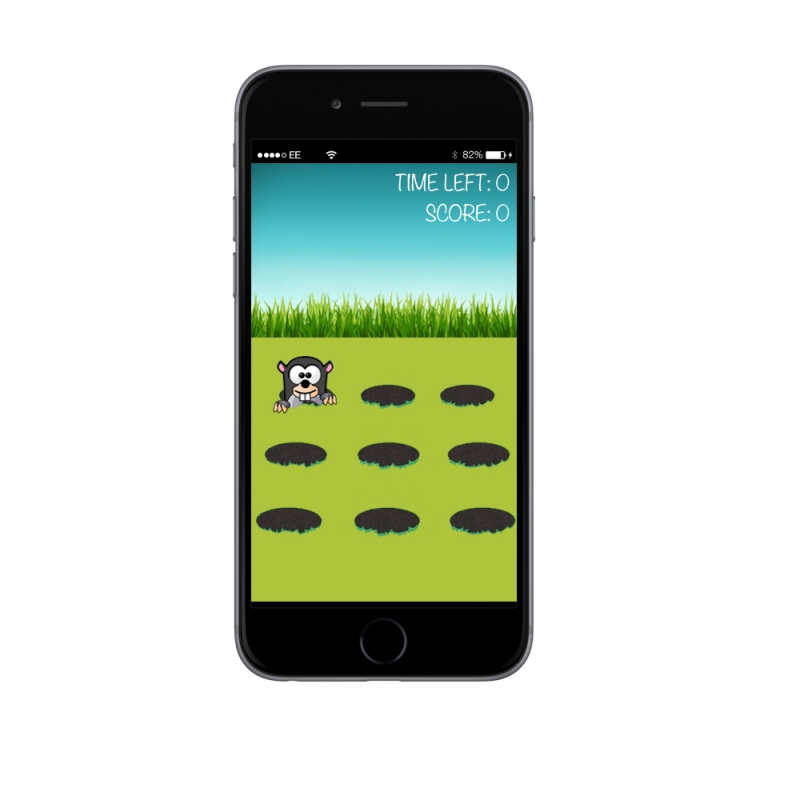 with the top games on the app store like angry birds etc
Here is my final design for the countdown to the play. This screen will show a countdown until the gameplay starts and they will be a 3 second countdown. Here is the design:

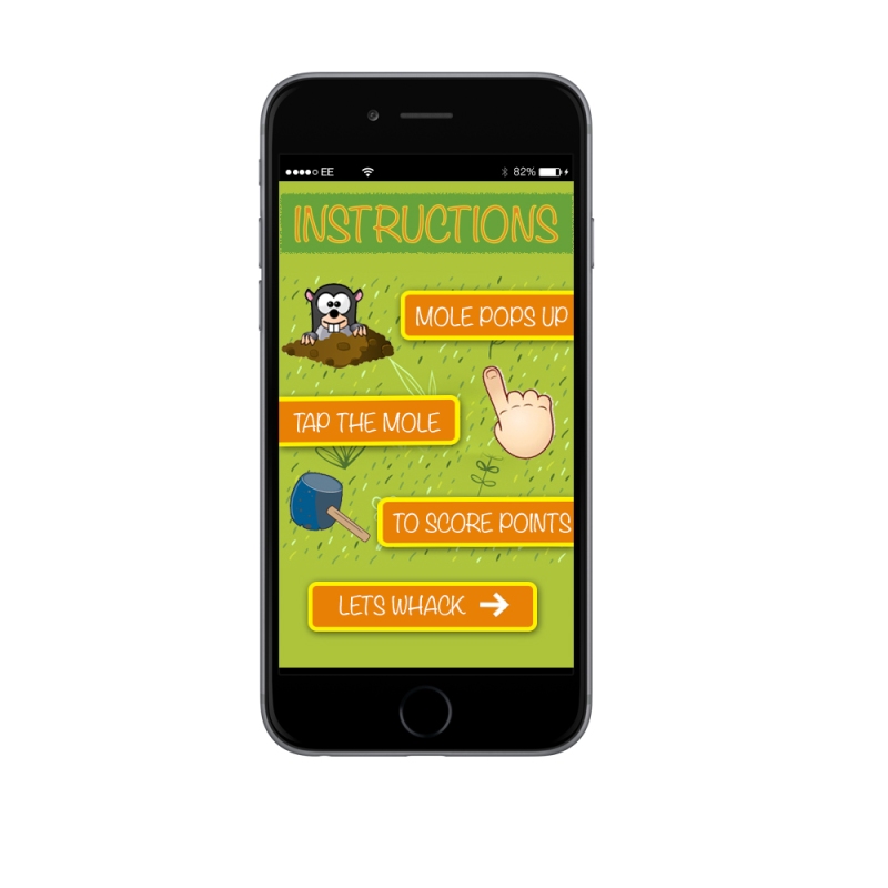
The Second Screen has stuck to the same structure as the first designs and that is the instructions. The Instructions will be laid out the same but just with a different design that mirrors the introduction screen and throughout the game.
So after a very productive session with Sally, we sat down and went over my first design and stuck with the structure of them but changed the designs just to make it more appealing to my target audience. Here are the updated and final designs of Animal Hunt.

Hi

This was my final design and i had gone with the navigation being in the top header along with the logo.
Site Map to follow
Hi,
After my final design i decide that i would look at different font types and font colours to depend what colours im going to have my logo for my business card and letterhead but also what colours i can allow to people who want to alter my logo.
Final Font Type: Noteworthy, I got this of the website DaFont and i think it shows off an web designers vibe. It shows yes they can code but they can also create fancy pieces of text and designs.
Final Font Colour: Ive gone for the bog standard black font colour here because i think it matches the font type which is like you have written the text yourself and you wouldn’t do that with any other colour. But i have also picked the red colour because of me being a Liverpool fan and liking the colour red, people will recognize me for my love of Liverpool and also shows change like a freelance web designer itself.
Here is the picture of the designs i created in Adobe Illustrator:
 Thanks
Hi,
After my first couple of designs i have finally picked my final design. I cant wait to present it in my presentation just to get abit of feedback so if i had any improvement i could amend them straight away. Here is my Final Logo:

HI,
I have Researched many of brands and found out that most of the brands for a web designer is just there name. Well i wanted to change this and maybe use my initials for a logo so people can remember me by. Here are the some of the logos i have created just for example:

but i wanted to get the edge that the Hull College Logo has

I also had this design where i wanted the R to interconnect the , like the Audi design

I have also put the 94 in my design just to make my logo more unique, because you wont find a freelance web designer with the name of Ross Barnett that was born in 1994. So i wanted people to recognize me for my logo.
A further post will show my final Design, and why i chose it.
Thanks
...(was) just a games design student
I am studying a BA (Hons) Web Design Degree at Hull School of Art & Design
Portfolio site to show the development of my uni work
The latest news on WordPress.com and the WordPress community.
